Showing posts with label Cover. Show all posts

Wednesday, February 1, 2023

Happy Groundhog Day (#IWSG February 2023)


I completely missed the January IWSG. I would love to say it was because I was so busy writing, but that would be a bold-face lie. 

I have been creative, not just in putting words to paper. I think back in November I mentioned I had started painting miniatures again? Well, I got a 3D-Printer for Christmas, so now I've been doing A LOT of painting...


Some people look at these tiny little things and think that painting them must be stressful, but I find it incredibly relaxing. I can paint for hours and the time just floats by. Sometimes (often) it gets finicky and difficult, but I fix it, redo it, try it again, or sometimes just move on. I've learned a lot in the last several months, and I like to think I've improved already.

I've always liked making things, especially small things (I was a Lego nerd as a kid), and I love games and art. I've found a way to bring them all together, which is pretty fulfilling.


That said, I do have a half-finished draft of Gale Harbour 3 staring me in the face, not to mention several other projects I'm either planning or actively working on. I'll get to them eventually, probably when the printer gets boring, or the fumes from it get so bad my wife makes me throw it out.

FEBRUARY QUESTION

If you are an Indie author, do you make your own covers or purchase them? If you publish trad, how much input do you have about what goes on your cover?

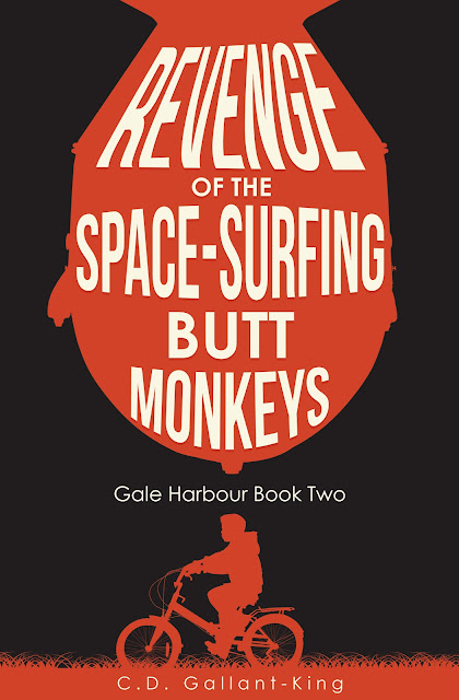
I have gone back and forth between making my own covers and having someone make them. The cover for Ten Thousand Days was commissioned, as were the current covers for the Gale Harbour books. Hell Comes to Hogtown was a combination, as I commissioned the text for the title, a friend of mine took the photo, and I put it together. 


I am always stuck in a situation where I know what I want but don't quite have the skills to make it happen, nor do I ever have the money to pay someone to make it. The covers I have paid for were all pretty cheap (hello, Fiverr!), so they're usually fine but never exactly what I wanted, either.

What about you? Is anyone ever really happy with their cover?

(I know they are, just let me pretend they don't so I don't feel so bad)

Have a great month!

Hugs & Kisses,
-CDGK


The first Wednesday of every month is officially Insecure Writer’s Support Group day. Writers post their thoughts on their blogs, talking about their doubts and the fears they have conquered. It's a chance for writers to commiserate and offer a word of encouragement to each other. Check out the group at http://www.insecurewriterssupportgroup.com/.

Tuesday, February 22, 2022

Revenge of the Space-Surfing Butt Monkeys: COVER RE-REVEAL?

So I wasn't completely happy with the previous cover for Gale Harbour 2: Revenge of the Space-Surfing Butt Monkeys. I had an idea but I just couldn't get it to confer what I wanted.

So here's a new version:


I do like this one, it's a lot cleaner and impactful than the previous one. There is, however, one glaring issue that someone pointed out to me, and now I can't unsee it. 

What about you? Anyone else have any thoughts on the cover?

Hugs & Kisses,
-CDGK


Wednesday, July 8, 2020

COVER REVEAL: Psycho Hose Beast From Outer Space!

Okay, so I revealed the cover when I announced the book last week. But I've been having second thoughts. About the cover, anyway.


The cover image I revealed to the world last week was, to be frank, not great. I mean, I've certainly seen worse covers, but I was never really happy with it, and I've since had some pretty negative feedback. Yeah, I get it, it's shitty, I know. But I had also kinda embraced it's shittiness. Which I recognize is not a very good way to do business.

So I went back to the drawing board, and came up with a slightly different version. Check this out:


The original cover was kinda busy, and a bit too literal. Not to mention the images were not quite right. The kids in the silhouette were obviously too old (they're 12-years-old in the book) and the picture of the monster was super cheesy. Still, I liked that it sort of looked like the poster for a cheesy slasher movie, which is what I was going for, but it just didn't look quite right.

The new poster, on the other hand has a few more things going for it. The single image is stronger, and the book literally does start with the discovery of a dead body in a lake. It's also quirky and odd, which matches my writing well. I always have trouble merging horror with comedy on my covers. Most importantly, the overall composition of the image is inspired by a certain album cover, released in 1992 (the same year the story is set):


I'm leaning deep into 90s nostalgia in this book, and music is a big part of it. Music actually figures into the plot in several important ways. To use a cover reminiscent of such an important album of that time period actually seems kinda perfect to me, even if my mediocre design skills can't quite capture what I'm going for exactly.

So what am I doing here? I guess I'm asking for your feedback? Of the two, which cover do you like better? Is the new one better enough to bother changing it? Should I go back to the drawing board and hold out for something even better? Or is the original cover good enough and I should go back to more important stuff? I actually had a couple of people say they liked it, but there was one very vocal detractor who made some excellent points.


Anyway, what do you think?

Hugs & Kisses,
-CDGK

Thursday, October 29, 2015

George Cotronis Cover Art Giveaway

Published by Kraken Press, art by George Cotronis
George Cotronis is currently running a competition to give away free covers on his website, and lemme tell you: Dude does awesome covers.

You can see a gallery of his published works as well as premade covers currently for sale at his website www.cotronis.com. His work is weird, creepy, kinda abstract. He reminds me a little of Dave McKean, which is a very good thing. They're perfect for a horror or dark fantasy book, which is right up my alley. He currently does art for Ragnarok Publications, Evil Hat Productions, Pelgrane Press and many others, which is some excellent credentials that speak very highly of the man's talents.

Full disclosure, writing this blog post fulfills criteria to give me a chance to win one of those wonderful covers, but I'm not ashamed of that. I would gladly pay the guy good money for one of these designs, but since the budget for my next book is somewhere around the $0 mark, my only hope is to win one in this contest.

Go check out his site and sign up yourself! Maybe you could be the one to slap one of these beautiful (and eerie) babies on the front of your book. We could only be so lucky.

Published by Ragnaork Publications, art by George Cotronis.

Related Posts Plugin for WordPress, Blogger...