
The cover image I revealed to the world last week was, to be frank, not great. I mean, I've certainly seen worse covers, but I was never really happy with it, and I've since had some pretty negative feedback. Yeah, I get it, it's shitty, I know. But I had also kinda embraced it's shittiness. Which I recognize is not a very good way to do business.
So I went back to the drawing board, and came up with a slightly different version. Check this out:


The original cover was kinda busy, and a bit too literal. Not to mention the images were not quite right. The kids in the silhouette were obviously too old (they're 12-years-old in the book) and the picture of the monster was super cheesy. Still, I liked that it sort of looked like the poster for a cheesy slasher movie, which is what I was going for, but it just didn't look quite right.
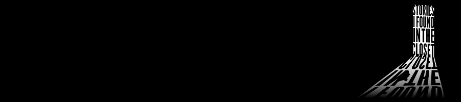
The new poster, on the other hand has a few more things going for it. The single image is stronger, and the book literally does start with the discovery of a dead body in a lake. It's also quirky and odd, which matches my writing well. I always have trouble merging horror with comedy on my covers. Most importantly, the overall composition of the image is inspired by a certain album cover, released in 1992 (the same year the story is set):

I'm leaning deep into 90s nostalgia in this book, and music is a big part of it. Music actually figures into the plot in several important ways. To use a cover reminiscent of such an important album of that time period actually seems kinda perfect to me, even if my mediocre design skills can't quite capture what I'm going for exactly.
So what am I doing here? I guess I'm asking for your feedback? Of the two, which cover do you like better? Is the new one better enough to bother changing it? Should I go back to the drawing board and hold out for something even better? Or is the original cover good enough and I should go back to more important stuff? I actually had a couple of people say they liked it, but there was one very vocal detractor who made some excellent points.


Anyway, what do you think?
Hugs & Kisses,
-CDGK
6 comments:
I'm not sure. The new one is simpler but the image is really dark and hard to see.
I like your second one better, but Alex has a point about the image. Maybe you can play around with the colors. The first one is too busy like you said and it isn't as appealing to me. Good luck figuring it out.
Agree that the first one is too busy,and the images don't seem connected. Maybe increase contrast a bit on the second one so we can see the body a little better. And no, you aren't wasting time doing this. Covers are important, and if you don't get it right the first time, pulling back and doing it again is the right choice. It worked for me.
Hi CD - I'm not sure either ... the word 'Hose' puts me off - because I don't know what it means ...
Re the cover - it's difficult to see the body lying as it does in the lake - I didn't know it was a body - ok ... I'm just glancing at it here on the blog ... perhaps get the kids to look more like kids. Good luck is all I can say - Hilary
When I did that image a few days ago, it looked great on the monitor I was working on. Going back at it now and looking at a few different screens, it looks completely different (and much darker). I think the print version will work fine, but you're right I need to completely fix it when I convert it to JPEG!
"Psycho Hose Beast" is a reference to Wayne's World. A certain group of people (and the target audience for the book) will get it. It's what Wayne calls his crazy ex-girlfriend.
It's a very Canadian term (again, fits into the theme of the book) - a "hoser" is a Canadian slang word from someone who isn't very bright.
Post a Comment